The Psychology of Fonts: How Typography Affects Website User Experience
The choice of fonts plays a crucial role in shaping the emotional tone of a website. Research in the field of psychology reveals that different typefaces can evoke distinct feelings and associations. For example, a serif font often conveys a sense of tradition and reliability, making it ideal for financial institutions or legal services. Conversely, a sans-serif font tends to feel more modern and approachable, which can be advantageous for tech startups or creative agencies. By strategically selecting typography, website designers can enhance user engagement and guide visitors toward desired actions.
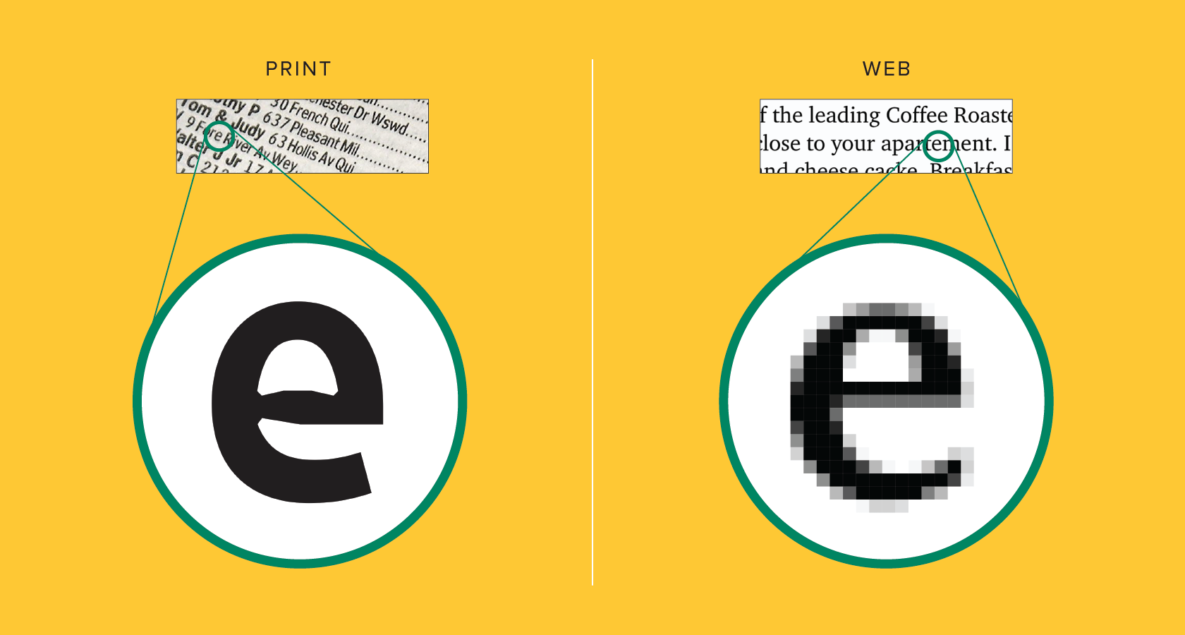
Furthermore, the readability of a font directly impacts the user experience on a website. Studies indicate that users are more likely to stay on a page if the text is easy to read and comprehend. Factors such as font size, line spacing, and contrast all play integral roles in ensuring that content is accessible. An optimal layout incorporates a harmonious blend of typography to create a visually appealing and digestible experience. In summary, understanding the psychology behind typography not only helps in aesthetics but also significantly influences user behavior and satisfaction.
10 Stunning Font Combinations to Elevate Your Website Design
Choosing the right font combination is crucial for enhancing the visual appeal of your website. A well-thought-out font combination not only improves readability but also conveys the personality of your brand. Here are 10 stunning font combinations that can elevate your website design:
- Montserrat & Open Sans: A clean sans-serif font paired with a simple, modern font.
- Playfair Display & Source Sans Pro: This pairing offers a sophisticated contrast between serif and sans-serif.
- Lora & Roboto: Lora’s elegant curves perfectly balance Roboto’s geometric precision.
- Poppins & Merriweather: A versatile combination that provides both modern and classic elements.
- Oswald & Raleway: A bold and refined pairing that can make your headings stand out.
- Raleway & PT Serif: Perfect for a clean yet stylish look.
- Quicksand & Helvetica Neue: This pairing combines friendliness with professionalism.
- Fjalla One & Open Sans: Great for creating a distinctive look with impactful headings.
- Cinzel & Cardo: Ideal for a classic and sophisticated feel.
- Nunito & Georgia: This cozy combination feels warm and inviting.
Choosing the Right Typeface: What to Consider for Your Website
When it comes to choosing the right typeface for your website, there are several factors to consider to ensure readability and aesthetic appeal. First and foremost, you should prioritize legibility—the ease with which text can be read. Avoid overly decorative fonts that may distract or confuse your audience. It's essential to select a typeface that aligns with your brand identity while also being functional. For instance, sans-serif fonts like Arial or Helvetica offer a clean and modern look, while serif fonts like Times New Roman provide a more traditional and formal appearance.
Another critical aspect to consider is font pairing. A successful typographic hierarchy can enhance your website's user experience. To achieve this, choose a primary typeface for body text and a contrasting typeface for headings. Additionally, pay attention to font size and line spacing, as they significantly impact readability as well. For example, headings should be larger and bolder to draw attention, while body text should have sufficient line height to ensure it is easy to follow. Remember, the goal is not only to make your content visually appealing but also accessible to all users.